Why We Love to make the Human Body A Palette of Colour
WHY WE LOVE TO MAKE THE HUMAN BODY A PALETTE OF COLOUR

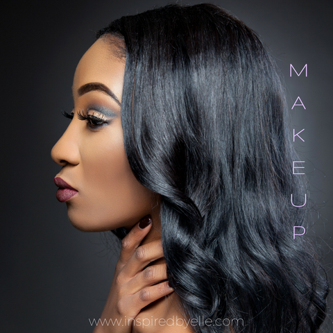
There has throughout history been a fascination of humanity with colour, and this is true of all genders and ages. Indeed, the pursuit of fashion trends has created a trillion dollar business globally. The pursuit of colour is not reserved for clothing and accessories, but also for the body in varying degrees. The world of makeup has seen extraordinary expansion in recent years also.

However, in terms of our health and wellbeing, colour does affect our mood and inner working systems. It can offer the therapy for the many ailments related to 21st Century living, from seasonal disorders to mental health issues.
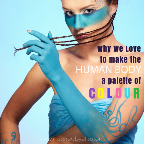
Some artists even literally make the body a canvas with sophisticated and elegant body art designs. We have seen growth in the tattoo industry, with this form of art being more normal, rather than the exception it used to be.

Some may argue that our interest in colourizing the human body is simply borne out of apathy or desire for change. Clearly, this may offer some truth but maybe as we delve deeper, we may gain better understanding.
What Is Colour?
The colour of any substance is not determined by what it is, but usually what it rejects, gives away or reflects. Something looks purple not because it is purple, but because it holds back everything that white light contains and reflects black as there is very little blue or red. So purple does not mean it is literally purple, rather a composition of pigments to cause that effect.
The primary colours (red, blue and yellow) have certain tendencies, like the fact red absorbs both green and blue light; where as blue absorbs both green and red. Our eyes only facilitate sight through the primary colours, and with this scenario of absorption occurring, there is little red or blue for the eyes to feast upon, and so the brain interprets this as a dark, almost black purple.
Therefore, on examining the colour purple, it is more accurate to understand it is not purple and is instead a combination of red and blue pigments in varying degrees are being illuminated as expressed in The Abney Effect. This gives birth to the concept of whatever you give away, will be your quality in the world.
Colour performs a vitally crucial role in our global environment. Colour has the ability to sway thinking, change moves, and cause reactions. Equally, it may aggravate or soothe your eyes (and person), boost your blood pressure or suppress your urge for food. Smart combinations of colouration can even save on strength intake. Colouration is even a powerful shape of communication in our living environment. Red is generally understood to mean "stop" and green to indicate "go." Traffic lighting and signalling uses this popular message around the world. Likewise, the colours used for products, websites, commercial enterprise, logos or emblems cause effective reactions. Colour matters in our world!
We are blessed to be living in the technology in which people have understood the power of colours and they have an effect on human life. Colours have been used for healing purposes historically for many years. They play a major function in setting up our temper, emotions, feelings, and state of thoughts. Even our buildings reflect unique colours which denote the character of labour or skill performed there. For example, most hospitals were historically painted green and white, however, nowadays all of them are painted in colourful and flashy colourings to temper the mind and make the consequent recovery less complicated and quicker. Most people are privy to the truth that the bedroom should not be painted vivid or colourful as those forms of colour can prevent sleep.
Colours can soothe or irritate our eyes. The medical experts have confirmed that colours can raise blood pressure and even upset our appetite. Every nation has a different colour of their national flag which has specific meaning to it. Multi-national companies conduct a lot of research and even engage colour analysts to know which colours to be used in their advertisements and promotional campaigns. Colours tend to send subliminal messages to our brain, and can often determine success or failure. It is interesting to note that every individual has a personal opinion about colour. Everyone has their own most preferred colour or colours. No one is neutral when it comes to colour. There are always colours which we like more than others and some we don’t like at all. By knowing which colour corresponds with our energy, we can accomplish our goal of colourization easier and faster.
What is the Fascination?

It is clear that colour creates subliminal reactions in our external world, which in turn affects our mood, happiness and ultimately health. We have tried to create these 'reactions' much closer to home by making our body the actual palette, and in this personal way we can selfishly enjoy this pleasure.
Each colour is able to conjure feeling and associations, so we use these to create a plethora of colour on our canvas of the human body. Here are some of the vivid imagery created by the use of specific colours.
Colours And Their Meaning
Red is the colour of energy, passion, action, ambition, and determination. It is also the colour of anger and sexual passion.
Orange is the colour of social communication and optimism. From a negative colour meaning, it is also a sign of pessimism and superficiality.
Green is the colour of balance and growth. It can mean both self-reliance as a positive and possessiveness as a negative, among many other meanings.
Yellow is the colour of the mind and the intellect. It is optimistic and cheerful. However, it can also suggest impatience, criticism, and cowardice.
Blue is the colour of trust and peace. It can suggest loyalty and integrity as well as conservatism and frigidity.
Indigo is the colour of intuition. In the meaning of colours, it can mean idealism and structure as well as ritualistic and addictive.
Purple is the colour of the imagination. It can be creative and individual or immature and impractical.
Black is the colour of the hidden, the secretive and the unknown, creating an air of mystery. It keeps things bottled up inside, hidden from the world.
Gold is the colour of success, achievement, and triumph. Associated with abundance and prosperity, luxury and quality, prestige and sophistication, value and elegance, the colour psychology of gold implies affluence, material wealth, and extravagance.
Silver has a feminine energy; it is related to the moon and the ebb and flow of the tides - it is fluid, emotional, sensitive and mysterious.
Grey is the colour of compromise - being neither black nor white, it is the transition between two non-colours. It is unemotional and detached and can be indecisive.
Brown is a friendly yet serious, down-to-earth colour that relates to security, protection, comfort and material wealth.
Magenta is a colour of universal harmony and emotional balance. It is spiritual yet practical, encouraging common sense and a balanced outlook on life.
Turquoise is communication and clarity of mind. It can also be impractical and idealistic.
Applying colour psychology in everyday life
It is now clear that colour psychology and its utilization in our environment can enhance our emotions and our state of mind. Some places make us feel negative while others can make us happier, calmer and more productive. Colour psychology has a direct impact one’s health. The colour red, for instance, evokes strong emotions and is often used by restaurants to stimulate their patrons’ appetites. Likewise, yellow is the first colour that an infant responds to. Yellow placed in the shops of windows can help grab the attention of shoppers. Yellow also helps encourage conversation and stimulates the mental and nervous system.
In Conclusion
A great deal of thought and consideration must be given to placement and usage of colour psychology in work and home environments as colour directly impact one’s physical and mental welfare. This is why we as human beings, utilise a palette of colour, to stimulate those emotions and reactions in our personal space.
Leave a comment
Comments will be approved before showing up.


